Mobile-first websiteConcept project
Designed for the way people actually browse.
A concept mobile website for Ninefold Coffee, a fictional neighborhood café — built from a 390-pixel screen up, not a desktop layout squeezed down.
Mobile isn’t a smaller desktop. It’s a different set of decisions.
Designed
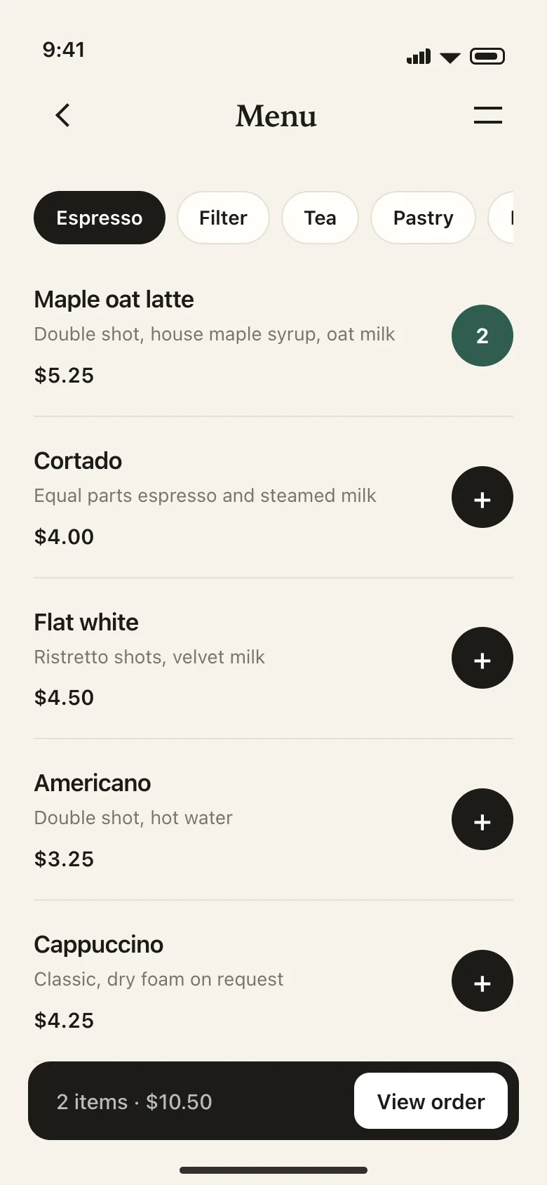
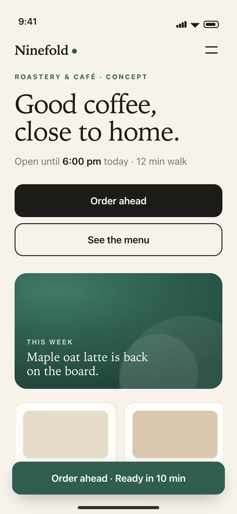
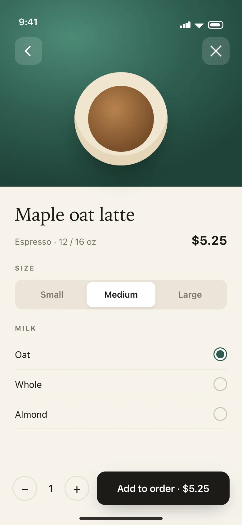
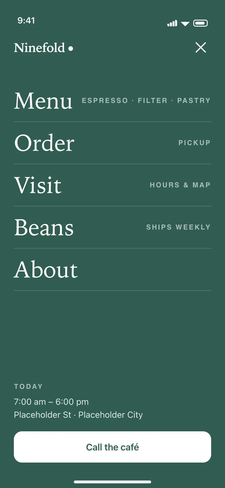
Four core screens for a café website — home, menu, item detail and a full-screen navigation layer — plus the sticky ordering bar that ties them together.
Intended to
Answer the three things a café visitor wants — is it open, what’s good, how do I order — inside the first screen, one-handed.
Considerations
The thumb zone, 44-point touch targets, one sticky primary action, compact hierarchy, chips instead of dropdowns, and type sized for arm’s length.
Hierarchy
One screen, three answers.
Before any scrolling: the café is open until six, ordering ahead is one tap, and the menu is the other. The headline is set in a serif so it reads warmly at arm’s length; everything below it is secondary by design.
The green bar at the bottom is sticky. Wherever a visitor scrolls, the primary action stays under the thumb.
Navigation
A place, not a dropdown.
Five links at 40 pixels each, with a one-line hint under each — big enough to hit without looking. Hours and a call button live inside the menu, because that’s what people open a café menu to find.
Close is a 44-point target in the same corner as the button that opened it.
Thumb first
The primary action lives in the bottom third of the screen. Secondary actions can live anywhere.
Touch targets
Every control is at least 44 points tall. List rows are taller, so a miss still lands on the right item.
One thing per screen
One headline, one action, one supporting line. If a screen needs a paragraph, it’s the wrong screen.
Chips over dropdowns
Categories, sizes and options are visible and tappable — never hidden behind a native select.
Type for arm’s length
Body copy at 16 pixels or larger, prices set in tabular figures, headlines that stay legible in sunlight.
Fast to scan
Price, status and quantity carry the information. Words are for the things numbers can’t say.
Design details
Warm, quiet, thumb-sized.
Good coffee, close to home.Serif display at 44px · system sans at 16px+ for everything tappable
Green is the one color that means “order.” It appears nowhere else.
Interaction. Add, choose, navigate — each with a target the size of a fingertip.
About this project. Ninefold Coffee is not a real business, and this is not client work. It is a self-initiated concept built by Snyder Creative Studio to show mobile-first design thinking. Every name, price and address in the screens is placeholder content, nothing was launched, and no results are claimed.
Want one for your business?
Send your business name and current website. I'll design a homepage concept for you, free and with no obligation, and reply by email within 24 hours.